
Responsively converting a sidebar to a navbar with React and CSS
This is a guided tour of a recent change I made to my own website: converting a sidebar to a top navbar when the user’s screen is small enough. I hope what I’ve learned can help others take their first steps into responsive web design!
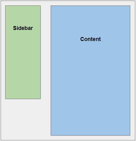
The goal
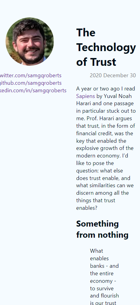
Given a website with the following general layout:
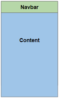
We will implement a device breakpoint that changes the layout for screens with fewer than 700px in width (like mobile phones) to this:
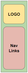
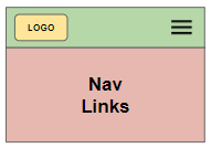
Furthermore, to conserve space in the smaller navbar, we will hide navigation links behind an expandable menu in the mobile experience, so that this sidebar:
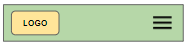
Turns into a navbar with a menu icon:
And when the user clicks the menu icon, a menu of navigation links expands down, producing this:
In action
Since this is what I just did for my live personal site, here’s a demonstration of the device breakpoint, the sidebar converting itself to a top navbar, and the nav menu expansion:
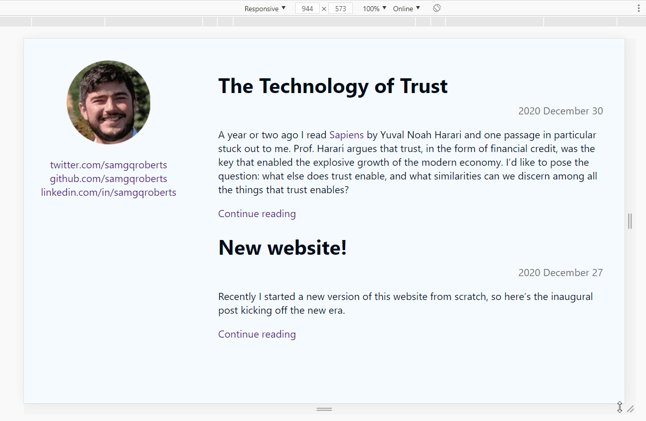
Note that here the “Nav Links” in the wireframes are links to my Twitter, Github, and LinkedIn profiles, and the “LOGO” is just a picture of my gorgeous mug.
Making it happen
I’ll show you how to make this happen in two steps: showing you the full picture of how I actually did it, and then explaining the important technical components of that implementation.
I’ve added annotations and documentation to the Pull Request where I actually implemented this for my site, so at this point go check that out and see the solution in-situ. Read the description, then look through the code in each commit, keeping in mind the explanation of what that commit is trying to accomplish.
Once you’ve seen it fully come together in the PR, it’ll help for me to decompose the full solution into the important technical components. What follows is a piece-by-piece explanation of the interesting things going on.
Using a CSS media query to implement a device breakpoint
The media query in the CSS is the fundamental way that the site behaves differently when the screen’s width is either above or below 700 pixels. Everything outside of that block is always applied, and everything inside that block is only applied if the query returns true, which in this case will only happen if the device is a screen (as opposed to other types of devices like a braille tactile feedback device) and has a minimum width of 700px.
The styles within the media query block will either introduce new styles or override the mobile-first styles above them in order to produce the proper experience for larger screens (eg. moving the top navbar to be a left sidebar).
Animating the nav menu’s expansion and collapse
The key is the transition CSS property. Our property is transition: max-height 0.3s, which means “whenever the max-height property of the selected element (in our case, the .navMenu) changes, animate that change over a period of 0.3 seconds.” We don’t specify a timing function, so the default of “ease” is used.
With that in place, we need to change the max-height property when the menu should be expanded or collapsed, which we do by adding or removing the CSS class .menuOpen. The max-height by default is 0, and with .menuOpen it’s 220px. When .menuOpen is applied, the browser will animate the max-height from 0 to 220px over 0.3 seconds, and the opposite will happen when .menuOpen is unapplied.
Why max-height instead of height? Unfortunately, transitions need exact values in order to operate properly. Ideally we would be able to say height is 0 when the menu is closed, then height is fit-content when the menu is open, but that sadly doesn’t work as far as I can tell. So max-height is a bit of a trick – we specify a value that’s approximately equal to (but a little larger than) the expected height of the expanded menu. This still lets the layout determine the exact height the nav menu should be. I believe any strategy for setting height directly, using the value that the layout has determined, involves using Javascript to query the height, which I wanted to avoid here in preference of a CSS-only solution.
Toggling a CSS class of the nav menu in React
In order to set and unset the .menuOpen class at the appropriate times, we track the openness as a React state variable and update it either when the user clicks the menu icon or when the user clicks outside of the nav menu. We then apply the .menuOpen class conditionally based on that state variable, using the ubiquitous classnames NPM package. Note that we’re using CSS modules here, so we have to get the actual CSS class name from the object exported by the CSS file.
Detecting clicks outside React components
The PR implements a React hook called useOnClickOutside that detects whether any mousedown or touchstart events have targets that are not contained within the given React refs, then executes the given callback. In our case, we give the nav menu and the menu icon as these refs, and our callback closes the nav menu (which has no effect if the nav menu is already closed).
Rendering SVGs in React
The menu icon is implemented as an <svg /> defined directly in React. There are multiple ways to render SVGs in React, the most popular of which that I’ve seen is implementing some type of build tool (eg. webpack) step to understand how to import raw .svg files. I wanted to avoid dealing with build tooling (at all costs, often) here, and opted for this React-only approach.
The definition of the svg itself is from Google’s Material Design icons, specifically this one.
A quick shout-out: Chrome DevTools
Being comfortable with browser development tooling is an essential part of web development. I use Chrome, so I’ve gotten very familiar with Chrome DevTools (other browsers certainly have their own flavors, I’m just not familiar with them). Using Chrome DevTools is almost as big a part of my web development process as using my text editor (VS Code, if you’re interested).
For what I did here, I made heavy use of its basic features for inspecting and changing styles, as well as its feature for testing different screen sizes (the “In action” gif above was created using this Device Mode).
Feels good to be mobile-friendly!
So there you have it. We brought a site from looking almost broken on a smartphone to looking like someone cares about their experience, which is a powerful thing. Personally, I’m just psyched that the 3 whole people that constitute my readership (the friends that I pester to read my stuff) won’t have to read the next one like this:
Thank you for reading!